Loco: Vertical Mobile Streaming · Visit Loco →
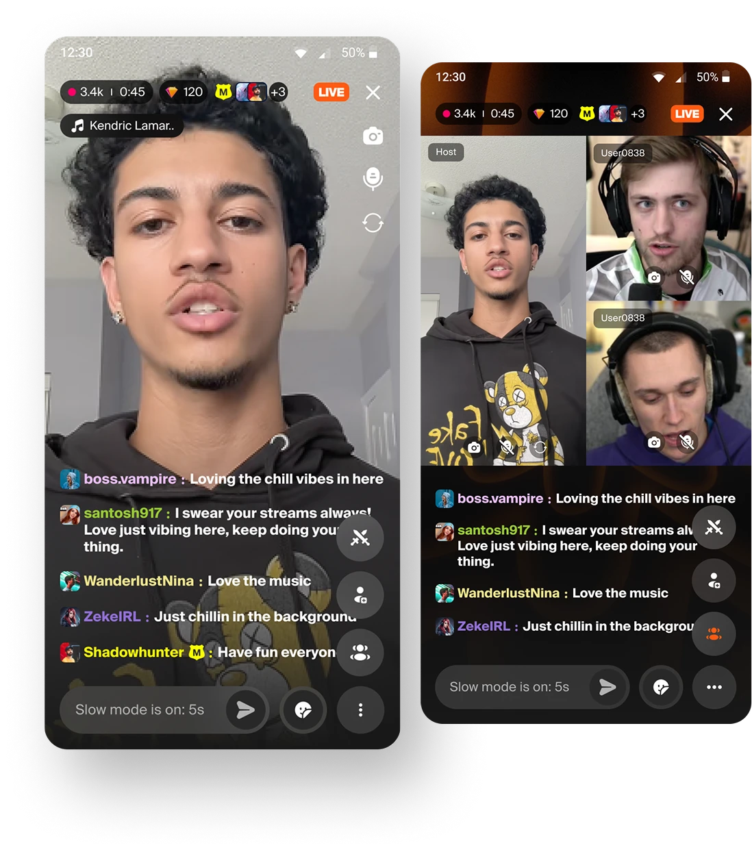
Designing vertical mobile streaming for Loco: letting creators go live from a phone in a few taps, on a platform built entirely around desktop screen-share.
Loco is a premier Indian live-streaming and esports platform. Until this project, going live meant screen-sharing from a desktop, which worked for gaming but excluded an entire category of creator: the mobile-first, lifestyle, in-real-life streamer.
Key takeaway
Designed the MVP for vertical mobile streaming, a new content format on a platform built for horizontal desktop gaming. The hardest problem was not the camera, it was making a second format legible next to the existing one without fragmenting discovery for either.
Context
Loco had no way for streamers to broadcast spontaneously from a phone, on a platform limited to desktop screen-share.
Mobile-first creators and lifestyle streamers had no route onto the platform at all, while Twitch, YouTube, and TikTok Live already offered mobile broadcasting. The exposure was concrete: creators leaving for platforms where going live was easier, audiences who consume on mobile never arriving, and the loss of the frequent, casual interactions that mobile streaming makes possible.
The timing mattered more than the feature gap. Loco was expanding into South Korea and the Philippines, where vertical mobile streaming is deeply ingrained in user behaviour. Platforms like AfreecaTV and Kumu built their positions on exactly this format, so arriving in those markets without it would have limited adoption from the start.
There was also a category shift underneath it. IRL content, meaning lifestyle, travel, and social interaction, was growing well beyond gaming, and that audience wants unfiltered and personality-driven rather than structured and produced.
My role
PLACEHOLDER: replace with your specific scope. Which flows did you own, who did you work with, and what were you accountable for?
The product requirements were owned by the PM. My work covered the design of the streamer and viewer experiences, the competitive benchmarking that informed them, and the decisions about how a second stream format would live alongside the existing one.
PLACEHOLDER: name the other people involved, for example the PM, engineering leads, and any other designers, and what you specifically drove.
Research
Vertical mobile streaming is a mature pattern elsewhere, so the useful question was not what to build but what users already expect. I benchmarked the viewing and going-live experiences across the platforms this audience uses daily.
I structured the analysis around the moments where a new viewer either stays or leaves: discovery, entry, high energy moments, and the process of going live. Framing it by moment rather than by feature made the gaps comparable across very different products.
The entry moment turned out to be the most instructive. Across TikTok Live, BIGO, YouTube Live, and Twitch, the platforms that hold a new viewer answer three questions in the first few seconds: what is happening right now, whether the viewer can influence it, and whether they are arriving early, mid-way, or at the end. Without those signals, a viewer who lands mid-stream is simply confused, and confusion at entry is the cheapest churn there is.
Asset slot: benchmark analysis
A view of your own comparison framework, for example the moment-by-moment gap table. Use your own artifact rather than competitor screenshots, since a structured analysis you produced is stronger evidence than a grid of other people's apps, and avoids filling your portfolio with third-party UI.
Approach
The MVP had to be lean enough to ship fast while establishing a format the platform had never carried. Each constraint had a design response.
Constraint 01
Constraint 02
Constraint 03
Constraint 04
The decision that mattered
PLACEHOLDER: confirm this is the decision you would defend, or replace it with the one you would.
A swipe-based discovery feed only works when there is something to swipe to. At launch, a brand new format on an existing platform has almost no live content, which meant the failure states were the likely states, not the edge cases.
So the design had to answer what a viewer sees when they run out of live vertical streams, what the homepage shows when very few people are broadcasting, and what happens when a streamer's camera goes off or their connection drops mid-stream. Each of those got a designed answer: past streams with high viewership as fallback content, a clearly marked mix of live and recent, and a friendly placeholder with chat still active rather than a dead screen.
PLACEHOLDER: add the trade-off you accepted here, and how you argued for spending MVP time on empty and failure states rather than on more features.
The flow
The streamer journey was designed to remove every step that was not strictly necessary between the impulse to stream and being live.
Asset slot: streamer flow screens
Screens for Go Live, stream setup, preview, countdown, live, and summary. Laid out in sequence these carry the section on their own, so this is the highest-value upload for this page.
Asset slot: viewer experience screens
Homepage vertical carousel, the live viewing screen with chat and stickers, and swipe-based discovery. Ideally include one empty or fallback state, since that is the decision the section above argues for.
Scope
Rather than one large release, the feature was planned in phases so the lightest version could reach creators early and the heavier social mechanics could be justified by real adoption.
Phase 1
One streamer, one camera. Go live, chat, stickers, moderation, and a stream summary. The lean core that proves creators want the format at all.
Phase 2
Multiple guests join by voice while the host stays on camera. Lowers the barrier to participation and enables the fan-call and talk-show formats these markets already expect.
Phase 3
Guests join on camera in a tiled layout with host moderation. Drives content variety, longer sessions, and creator cross-discovery.
Outcome
PLACEHOLDER: this section needs your real numbers or, if the feature has not launched, an honest statement of where it stands.
The success measures defined for the feature were: number of vertical streams created, viewer watch time and average session duration, unique streamers and viewers adopting the format, streamer revenue through stickers, retention and return visits, and the diversity of content categories beyond gaming.
PLACEHOLDER: replace with results against those measures. If the feature is unreleased or you left before launch, say so plainly. A case study that ends with "here is what we defined as success and here is where it stood when I handed it over" is credible. One that implies results it does not have is not.
What I learned
PLACEHOLDER: two or three paragraphs in your own voice.
Prompts, in case they help. Designing a format the platform had never carried meant borrowing conventions from products your users already knew: how did you decide what to adopt and what to do differently? Did designing empty and failure states first prove correct once real content volume arrived? What would you change about how the two stream formats coexist?
The durable lesson
One sentence that generalises past this project.